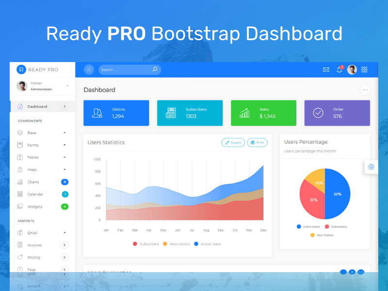
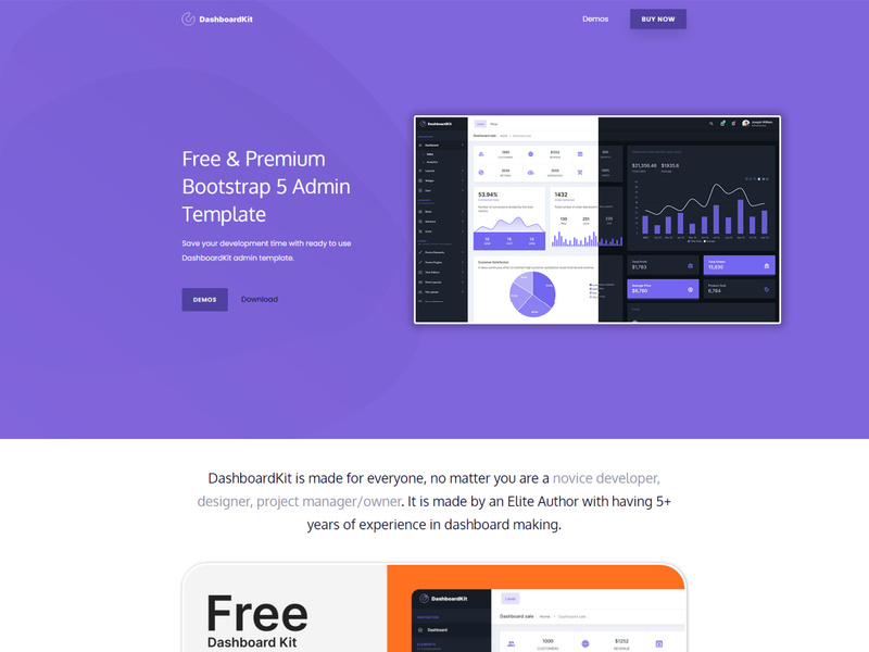
Bootstrap UI kit
UI kits that can help you build your website faster


About Bootstrap 4
This is a great css framework that set the bar for structural systems when it comes to building a website that looks good on all devices. I can not think of a period when another framework was more popular so I think it's safe to say bootstrap was first at this.
Bootstrap was started by Mark Otto and Jacob Thornto that worked at Twitter at the time. It was launched in 2011 and it was mainly used internally at twitter to have a better system for building pages instead of relying on custom css or classes.
The most notable thing about how it works is that you have the whole page split in 12 columns and those will be just enough to have the information placed properly on all devices.
How it works
You define a container and then set the row for each element. Then you can just add columns in that row to specify the size of each content. You can set different column sizes for different devices. So you will have col-xs-12 for full width on mobile phones and col-lg-6 for half-width on the large screens.
There are also different components you can use for this and that can be styled and modified using a very simple SCSS variable file that will make your life easier.
Our themes here use the new framework and can be as well styled with ease by just changing some variables in the variables file. You can get in contact with us via chat or by email so don't hesitate to do that if you need any help.
