Banking App UI KitPremium
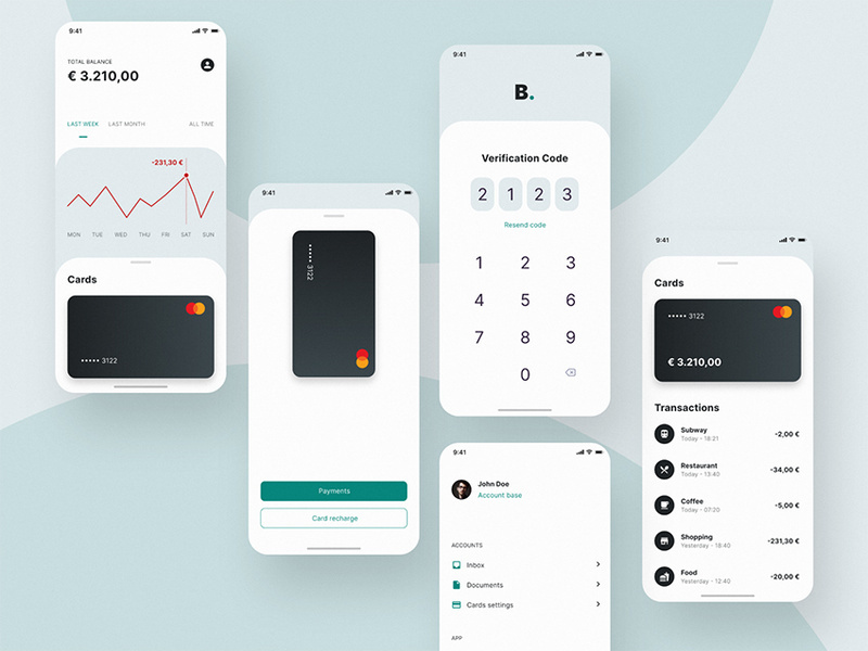
A great way to improve readability in your banking app design is to convert long lists of options to cards. Also, that is, instead of having a vertical list of text links, use cards with text and symbols that your users can tap on.
Group your cards in a way that looks like they form a set of panels or a grid. Moreover, arranging options on cards in this way guides a user’s eyes more easily. It makes each option more visible, helping the user find the feature or service they’re looking for faster. That’s why it is saving time and improves usability.
A good example of using cards to achieve this end is the challenger bank, this mobile banking app design. In the insurance section, each product is a card, instead of a long vertical list. Each card has a microcopy providing a description and an image.
The result is a more simple UI design. It makes the options readable and design-friendly. For you, it’s a win-win round.
