Cosmos UI KitPremium
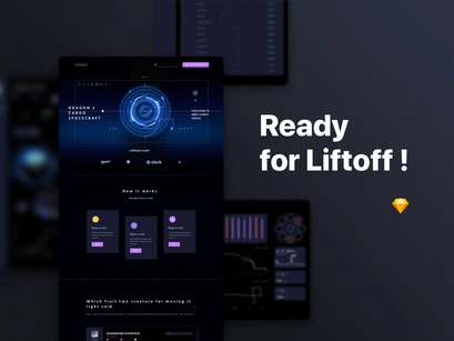
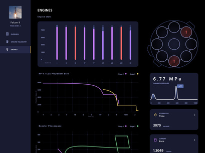
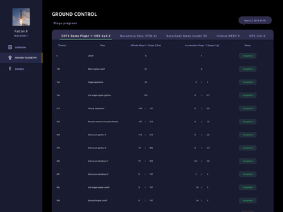
Cosmos UI kit is a creative dark sci-fi concept with 4 UI pages, created to boost your web projects and help you save time and energy in designing. All screens and elements are fully customizable and well-organized.
Pages:
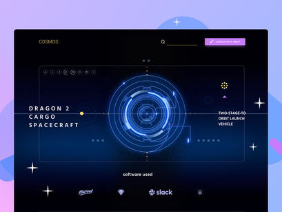
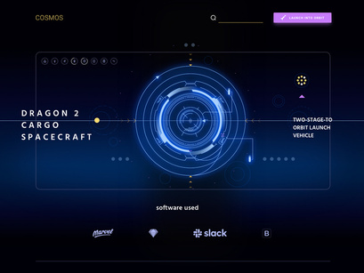
- Landing Page that presents the system
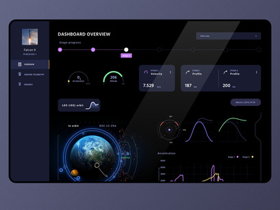
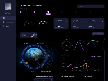
- Dashboard with stats and parameters on the aircraft's whereabouts
- Table of events
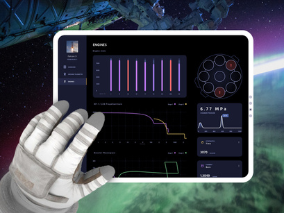
- Engine Page with stats and visualization
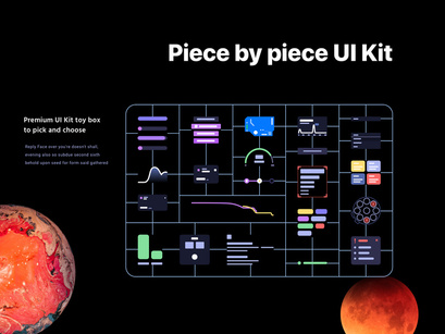
This Kit can be used to build other sci-fi inspired webpages with the vector elements inside:
- icons
- cyber illustrations
- buttons
- info cards
- text styles
- table
- graphs
- stats
- loading bars
- tags
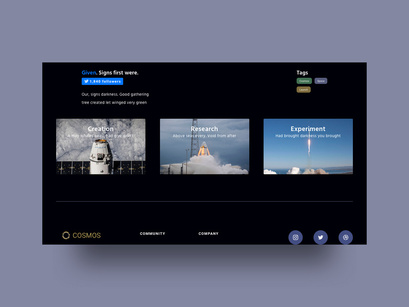
- header
- footer
- wireframe
All are made vectorial in Sketch with proper Titles, Groups, Styles and Symbols, with a file size of 46.6 MB.
✓ This UI Kit is super-useful to speed up a design workflow due to its flexibility and ease of use.
Highlights
- Dark Themed
- 100% scalable Vectors
- Fully Layered & Organized with proper Names
- Easy to change color style
- Compatible with Sketch
Dark colors like black and dark blue are mostly associated with richness. With these colors, you don’t need too many other elements to play around and that is why when it comes to web design most of them play it safe with dark themed designs.
Too many colors can easily distract the attention whereas dark color can help you stay focused maybe that is the reason why these UI kit design have such dark-colored layouts. It is much easy to focus on the information given on the website or app because of the dark background. The other design elements like typography have also been intelligently used on the UI kit.
If you are looking forward to creating a dark-themed UI kit, as a personal or professional project, here is a nice idea and inspiration for you. These design will help you built a classy dark UI kit design.
The Dos and Don’ts of Dark Web Designs
- You can be liberal with the usage of the color black and its shades but make sure that it doesn’t look too heavy or else the user might find it difficult to stay on the website or app for long.
- Fonts style and font size are something have to be taken care of with dark colors. The fonts should be done in a way that enhances the aesthetics of the page.
- Just because the main color of the design is dark, doesn’t mean you can’t use white. Make sure to use white space well, to provide a breather to the eyes.
Don't forget to check out the preview images in full size, so you can see the details of this UI, and feel its graphic design.
By using these UI Kit, you can give a modern and refreshing look at your projects, and you can reduce the cost and the time spend on designing them.
Don't forget to check some similar UI Kit Designs:
- Ground UI Kit: https://www.epicpxls.com/items/ground-ui-kit
- Blossom Fintech UI Kit: https://www.epicpxls.com/items/blossom-fintech-ui-kit
- Point of Sale App UI: https://www.epicpxls.com/items/point-of-sale-app-ui
- Landing Page Builder UI: https://www.epicpxls.com/items/landing-page-builder-ui
- Face Recognition App UI: https://www.epicpxls.com/items/face-recognition-app-ui
If you enjoy the UI kits here on our site, don't forget to share with your friends and please click follow so you will be notified for more cool products in the future.
You may want to check all the files in the kit before you download it.
Special thanks for EpicCoders (http://epiccoders.co/) for designing and working for this.
Your feedback and opinions are very important to us! Should you have a question, concern or suggestion - don't hesitate to reach us out on our social media pages and we'll answer as soon as we can.
- Facebook - https://facebook.com/epiccoders.co/
- Twitter - https://twitter.com/CoEpic
- Instagram - https://www.instagram.com/epicpxls/
You may also email us at contact@epicpxls.com
Thank you and enjoy designing!
EpicPxls <3
