Hofmann Responsive UI Kit Sketch Resource
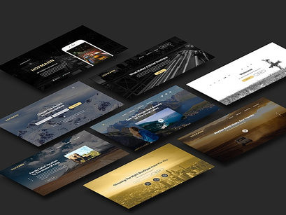
We're proud to present to you Hofmann - new and truly responsive UI kit designed by our friend, Elias Bikbulatov.
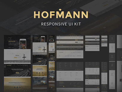
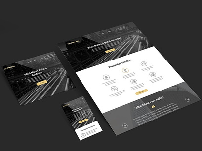
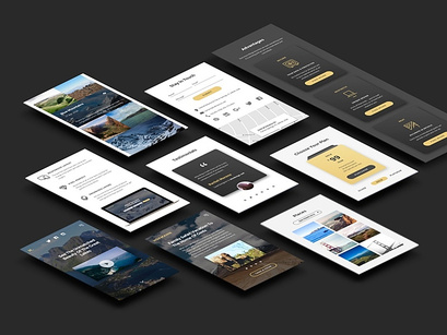
Hofmann is created for responsive web pages and is based on classic Bootstrap breakpoints. This is a massive, extremely detailed, well-organized, and versatile UI kit. It contains 3 layouts: Large Desktop, Tablet and Phone. Features: Pixel-perfect baseline grid, 3 layouts, different variants, scalable vector icons, typography and styleguide, basic page templates.
If you like this resource, please thank Elias by following him on Twitter and sharing this great freebie.
Comes with:
• clean design
• well organized elements
• editable content
This unique design can bring an added value to your design project or things that you plan to apply this design to.
If you enjoy the UI Kits here on our site, don't forget to share with your friends and please click follow so you will be notified for more cool products in the future.
You may want to check all the files in the kit before you download
Special thanks to Elias Bikbulatov (https://www.behance.net/okodesign) for designing and working for this.
Your feedback and opinions are very important to us! Should you have a question, concern or suggestion - don't hesitate to reach us out on our social media pages and we'll answer as soon as we can.
- Facebook - https://facebook.com/epiccoders.co/
- Twitter - https://twitter.com/CoEpic
- Instagram - https://www.instagram.com/epicpxls/
You may also email us at contact@epicpxls.com
Thank you and enjoy designing!
EpicPxls <3
