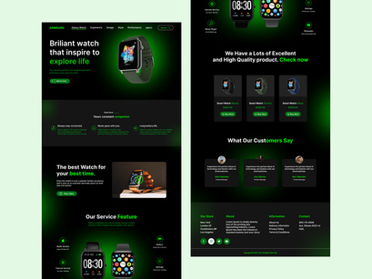
Designing a landing page for a smartwatch website involves creating an appealing and user-friendly interface that effectively showcases the features and benefits of the product while encouraging visitors to take action. Here's a description of a potential smartwatch website landing page design:
- Header Section:
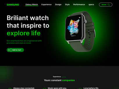
The top of the landing page features a clean and minimalistic header with the brand logo and a simple navigation menu for easy browsing.
- Hero Banner:
The hero banner prominently displays the latest smartwatch model, showcasing its sleek design and key features through high-resolution images or an engaging video loop. A concise and compelling tagline highlights the product's main selling point.
- Product Highlights:
Directly below the hero banner, there is a section highlighting the key features of the smartwatch, using visually appealing icons and brief descriptions. These features could include health tracking, connectivity options, battery life, and more.
- Call-to-Action (CTA) Section:
A clear and bold call-to-action button encourages visitors to learn more, prompting them to scroll down or click for additional information.
- About the Smartwatch:
A section providing a brief overview of the smartwatch, emphasizing its benefits and explaining how it can enhance the user's lifestyle. This could include benefits such as fitness tracking, notifications, customizable watch faces, and water resistance.
- Testimonials and Reviews:
Incorporating authentic customer testimonials or reviews to build trust and credibility. Real-life experiences from satisfied customers can showcase the product's reliability and value.
- Feature Details:
Present detailed information about the smartwatch's features, with a combination of text, images, and interactive elements. This section can cover features like health monitoring, app integration, display quality, and more.
- Product Variants:
Display different variants or models of the smartwatch with their respective prices, accompanied by clear images and a "Buy Now" button.
- FAQ Section:
Anticipate and address common questions potential customers might have regarding the smartwatch, providing clear and informative answers to help them make informed decisions.
- Newsletter Signup:
Include a section where visitors can sign up for the newsletter to stay updated on the latest product releases, promotions, and news.
- Contact Information:
Provide contact details or a contact form for inquiries, customer support, or assistance, reinforcing accessibility and trust.
- Social Media Integration:
Incorporate icons or widgets linking to the brand's social media profiles, encouraging visitors to follow and engage for updates and community interaction.
- Footer:
The footer section includes essential links, legal information, and copyright details, ensuring a complete and professional webpage.
The overall design should prioritize a seamless user experience, engaging visuals, informative content, and clear calls to action to guide visitors toward making a purchase or learning more about the smartwatch.
