Kitchen Sink Typeface
Description
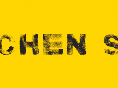
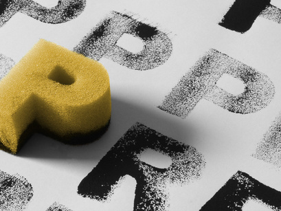
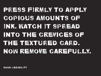
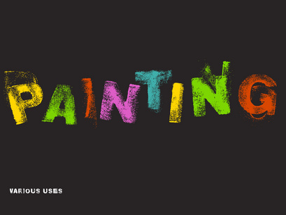
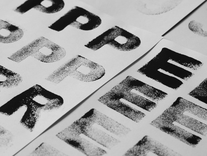
This typeface is named after the favourite haunt of the sponges which were used to create it - the kitchen sink. To create each letter, a shaped sponge was covered in acrylic paint, dabbed onto paper plenty of times and then scanned.
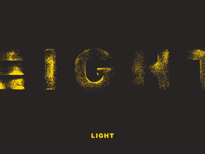
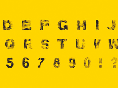
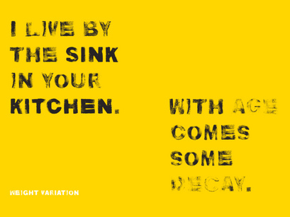
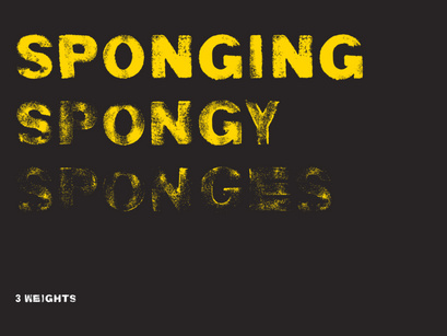
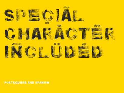
In order to create variation to achieve a handmade effect when used, each letter has two versions which can be toggled just by selecting upper or lower case. The typeface consists of three styles - light, regular and bold. I reimagined these three words to represent the amount of ink applied rather than the weight of the font!
