Luxury Watch Website Design
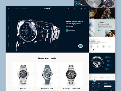
The luxury watch business is becoming increasingly competitive as new firms embrace innovative designs and technologies to keep up with established brands. This approach to luxury watch website design allows for better brand communication with consumers and allows for the creation of unique selling points.
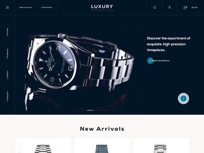
Most high-end websites have always used subdued colour schemes, as this allows them to convey a sophisticated vibe that works well with precious metals. The photographs are nicely positioned, and we've used lots of white space to give this site a grandiose appearance.
The descriptions are dynamic and lively, focusing on the visitor's emotions and imagination rather than a dry exposition of the function. It is aesthetically pleasing, has a premium feel, and keeps the visitor interested throughout.
What do you think of this design? Press❤ "L" if you like it.
Tools: Adobe XD & Adobe Illustrator
Inspired by good app designs? We can help you transform yours just the way you like it 👋 Drop a line at 📩 biz@cmarix.com or Visit Us - https://www.cmarix.com/inquiry.html#utm_source=Watch_Website_Epicpxls


