Sign Up Screen
Hi guys!
Today we are posting an interesting blue UI Kit that you can use for some handy tools that can improve your UI / UX design.
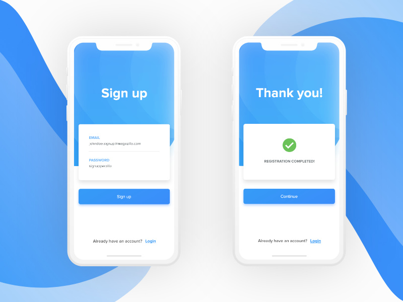
Sign-ups should be quick because it is the last thing users want to do. A lot of users get annoyed by filling up a long registration form, so here's a creative UI kit that comes with a clean concept featuring a minimal and quick Sign Up form with only two input fields, email and password.
Due to the smaller screens and unease of typing passwords and other information on mobiles, the inputs we need our user to fill up is kept minimal, unless we want them to drop off. The email vs username dilemma is a no-brainer when you think about it. Who remembers all those unique usernames you are supposed to come up with?
Whatever you need a nudge to start work on your idea or find inspiration, grab this interesting blue Sign Up UI kit designed and released for free by Muhammad Habibulloev!
This UI kit consists of 2 screens:
- Sign Up screen
- Registration Completed screen
Feel free to download as it is a freebie, and if you like this UI as much as we do, please click "follow" for more cool items!
Design work by Muhammad Habibulloev (https://dribbble.com/awebdes)
Thank you!


