Student Loan App Sketch Resource
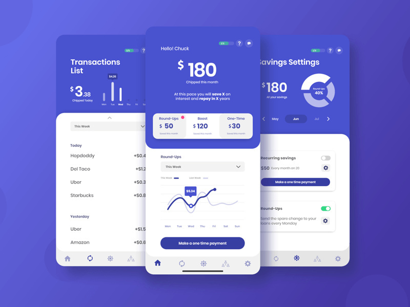
Student loan UI kit designed by Milton Solis. It contains 28 screens that are ideal for loan, crypto, banking and many other types of financial apps.
Student loans and savings app — Helping users to regain control of their personal finances
Overview
The client was looking to create a comprehensive solution to help its users to pay for their student loans faster and effortlessly.
The Problem
Student loan debt is making life difficult for an entire generation, is one of the main things interfering when taking financial and life decisions.
The Goal
Provide tools to give users control of their student loan debt and overall finances.
What do interviews tell us?
We started noticing certain patterns and things users prefer and want in this type of app.
42.9% of users want to set up payments individually (pay for one loan and not the others or adjust ratios), custom payment plans
57.1% need financial advice provided for a person or A.I (recommendations and strategies on how to pay loans)
35.7% will find useful notifications about due dates and other important dates related to loans
Forecasting charts or tools to see the future impact 28.6%
In-depth information about how much user owes and how many loans 28.6%
Aesthetics (interaction, visual design, easy navigation) 35.7%
Architecture & Functionality
With all the data and user insights in mind, I started to think about certain user journeys based on current features, a goal-oriented design methodology to find out how the user could complete and interact with a feature from start to finish.
Navigation maps and architecture
A big part of the exercise was to not only find out how the screens connected between each other, but also understand and explore the different elements present on each screen.
Interface design and hi-fi prototypes
A design focused on functionality and simplicity, easy to follow and adaptable. Two sections per screen guiding user attention. On top a summary section, the main focus to help users to gather information faster. Then, on the bottom a white section inviting to take a step back and pay attention, perfect to show more complex information, lists, filters, and controls. These elements defined the whole app experience creating a cohesive and easy to navigate app.
Interaction Loops
Short examples of interaction and transitions between elements and screens
If you enjoy the UI kits here on our site, don't forget to share with your friends and please click follow so you will be notified for more cool products in the future.
You may want to check all the files in the kit before you download it.
Special thanks for Milton Solis (https://dribbble.com/milton_solis) for designing and working for this.
Your feedback and opinions are very important to us! Should you have a question, concern or suggestion - don't hesitate to reach us out on our social media pages and we'll answer as soon as we can.
- Facebook - https://facebook.com/epiccoders.co/
- Twitter - https://twitter.com/CoEpic
- Instagram - https://www.instagram.com/epicpxls/
You may also email us at contact@epicpxls.com
Thank you and enjoy designing!
EpicPxls <3


