DESCRIPTION
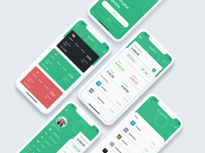
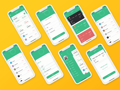
Wallet banking Mobile App UI Kit is a full featured mobile UI Kit for getting started with daily transactions, ATM Cards and bank accounts allowed to be synced with 3rd party applications. The UI Kit includes 38 screens for iOS providing many useful widget-style components for your inspiration.
Key Features
38 iOS Screens
375x812 Resolution
100% scalable Vectors
Totally based on Flat Design Standards
Fully Layered & Organized with proper Names
Poppins fonts (Included on download package)
Easy to change color style
Well-documented Help file
Compatible with Adobe XD
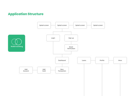
Pages Included
- Splash Screen 1
- Splash Screen 2
- Splash Screen 3
- Splash Screen 4
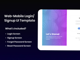
- Login
- Login filled
- Signup
- Signup filled
- Email Verification
- Forgot password
- Side Menu
- Dashboard
- My cards
- My accounts
- My transactions
- Notifications
- Notification detail
- Transaction detail
- Add card
- Add account
- Add a transaction
- Verify bank account
- Search
- Loans welcome page
- Loan providers
- New loan
- Current loans
- Loan history
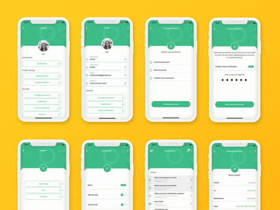
- Personal information
- Change password
- Change pin
- 2 step verification
- Settings
- Notifications
- About app
- Support
- FAQ
- Contact
Source & Credits
Fonts: Poppins [google fonts,, included in the files]
Image: Pexels
How to Use Adobe XD Files
Via the assets and components section of the file, you can make general changes to the colors, font style and components; affecting the entire layout at once.
Click on the assist panel or shit+Command+Y / shift+control+Y to display the assets panel; right click and edit to make changes to the colors or Character styles.
For components, right click and click on edit Master components to make changes to every component linked with the master component.
To easily use for Android screens, edit the iPhone Screen Defaults master components and replace the inner components with your preferred Andriod status bar and home bar. Alternatively you can update the individual Status Bar - iPhone and Home indicator - phone Master components to have the same effect.
Please to get more understanding, watch the video from Adobe Creative Cloud YouTube Channel: https://www.youtube.com/watch?v=bu5khe2H2-c
