Hello Everyone! 👋👋👋
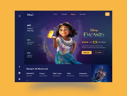
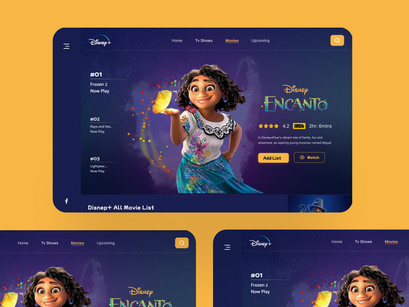
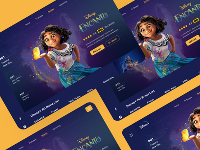
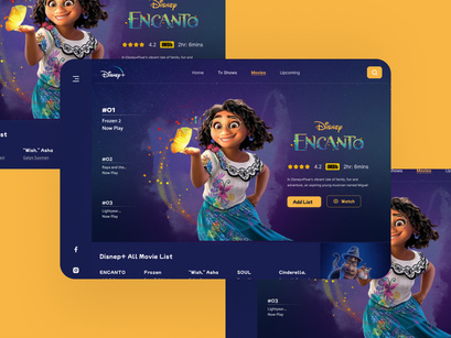
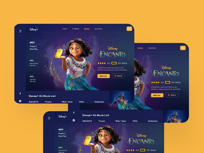
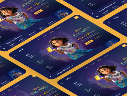
I want to share my latest exploration about Disney+ Redesign Challenge
That sounds fantastic! Redesign challenges often spark creativity and fresh perspectives.
What aspects did you focus on for the Disney+ redesign challenge? Was it user interface, user experience, or something else entirely? I'd love to hear more about your exploration!
Highlights:
✅ Disney Land of Landing page Design
✅ Well Organised Layers and Groups
✅ Screen size: Desktop (1440x1024px)
✅ 100% Fully Customisable
✅ Scalable vector & Free Google Fonts
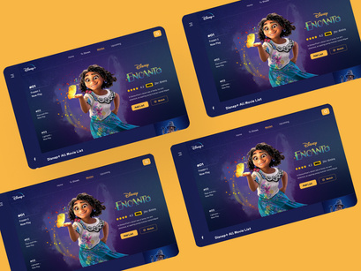
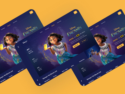
✅ Showcase Design
Compatibility:
✅ Figma And sketch
Note : All images on the demo is just for preview purposes only and not actually included on the files.
Hope you enjoyed it and I'd love to hear your feedback in the comments section below. I Hope you guys will like it. Press "L" or leave comment to let me know something.
Don't forget to UPVOTE if you like it! Have a nice day.. 👋
😉 My Blog Website : https://ripakater.blogspot.com/
💜 Uplabs - https://www.uplabs.com/uxlab
AUTHOR
UX Lab Avatar
UX Lab
0 followers
POPULARITY
1
0
0
PRODUCT DETAILS
Dec 22, 2023
Basic License
TAGS
LandingpageAppuiAppdesignMovielandingpagedashboarduiuxdesignweb
SPREAD THE WORD
DON'T WANT TO SEE ADS? SUBSCRIBE
